In today's digital age, where moments and creativity often originate in the digital realm, the transition from screen to print can be an intricate journey. Enter OneClickLayout (OCL), a dynamic digital-to-print service committed to enhancing this experience. We embarked on a mission to transform OCL's website, not just optimizing its website but also crafting a compelling brand identity. This case study delves into the multifaceted challenges encountered by OCL, our strategic approach to surmounting them, and the remarkable outcomes achieved.


OneClickLayout is a digital-to-print powerhouse, dedicated to helping individuals and businesses breathe life into their digital memories, designs and writing through exquisite, tangible prints. From cherished photographs capturing timeless moments to tailor-made (art)works, OCL caters to a diverse clientele seeking to bridge the digital-to-physical divide. Their commitment to quality and convenience places them at the forefront of the competitive market.
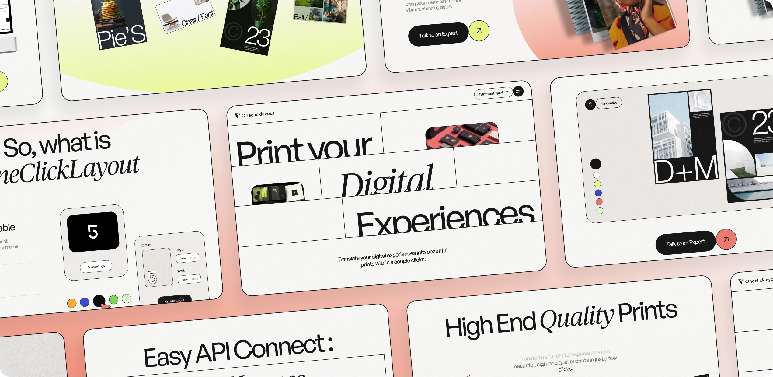
Their primary objectives were clear: streamline customer journeys, rise above the crowd in a saturated market, and establish an unshakable online presence resonating with their brand identity. Recognizing the pivotal role of a robust brand, OCL sought not only to redefine its visual identity but also to enrich the overall user experience.
Challenges:
Customer Journeys: The path from the digital realm to the physical print often resembled a labyrinth, confusing users with a multitude of options, formats, and complexities, thereby hindering seamless order placement and efficient interactions.
Website Design: In a market teeming with run-of-the-mill online print websites, OCL faced the formidable task of swiftly capturing user attention and engaging them effectively. Weaving an intuitive user interface with a captivating user experience became a paramount challenge.


Strategy:
Our strategic approach for OCL was all-encompassing, extending beyond mere website redesign to include the inception of a unique, resonant brand identity. Key elements of our approach included:
Crafting Brand Identity: We kicked off the project by meticulously crafting OCL's brand identity, including a visually striking logo, a distinctive color palette, carefully chosen typography that personified the brand, and the articulation of a consistent brand voice.
User-Centered Design: Placing users at the epicenter of our decision-making, we adopted a design thinking approach. This ensured that every facet of the design, beyond its aesthetic appeal, aligned harmoniously with user preferences and expectations.
The complexity of customer journeys was addressed through a series of thoughtful strategies:
Information Architecture: We overhauled the site's content structure, allowing users to swiftly access what they sought, eliminating redundant clicks and superfluous pages.
Navigation Enhancements: A step-by-step guide, prominently featured on the homepage, was introduced. It deftly ushered users through the process of transforming digital memories into prints, making it accessible even to first-time visitors.
Content Optimization: Every piece of content underwent refinement to ensure clarity and conciseness, ensuring users never felt overwhelmed. FAQs, tutorials, and support resources were strategically accessible, lending a helping hand at any stage.
Visual Hierarchy: Typography, color schemes, and spacing weren't mere embellishments; they were strategic tools to guide users' attention effectively, facilitating intuitive navigation.
Animation and Interactivity: Animations weren't just eye candy; they played a pivotal role in storytelling, elucidating processes, highlighting critical information, and elevating overall user engagement.
Resonance with the Target Audience: Rooted in insights into the target audience's preferences, our design choices were deliberate. Each imagery selection, color palette, and micro-interaction was meticulously curated to evoke feelings of trust, simplicity, and premium quality.
Integration of Branding Elements: Going beyond the logo, OCL's entire brand identity found vivid expression in the website design. The color palette exuded trust and reliability, typography reinforced a sleek and efficient brand persona, and a consistent brand voice permeated all content.

By redefining OCL's digital identity with a blend of simplicity, aesthetics, and user-centric design, we played a pivotal role in elevating their digital-to-print journey. This case study vividly illustrates the transformative power of a visually striking, user-friendly website in conveying brand messages and guiding users toward meaningful actions—transforming digital designs into captivating, printed memories.


.svg)
.webp)
.webp)

.svg)